You spend months perfecting the code, weeks refining the feature set, and a small fortune on user acquisition. The launch numbers look promising. But then, the silent killer strikes: churn.
Users in Germany are uninstalling after three days. Users in Saudi Arabia aren't getting past the sign-up screen. The problem usually isn't your functionality; it is your interface.
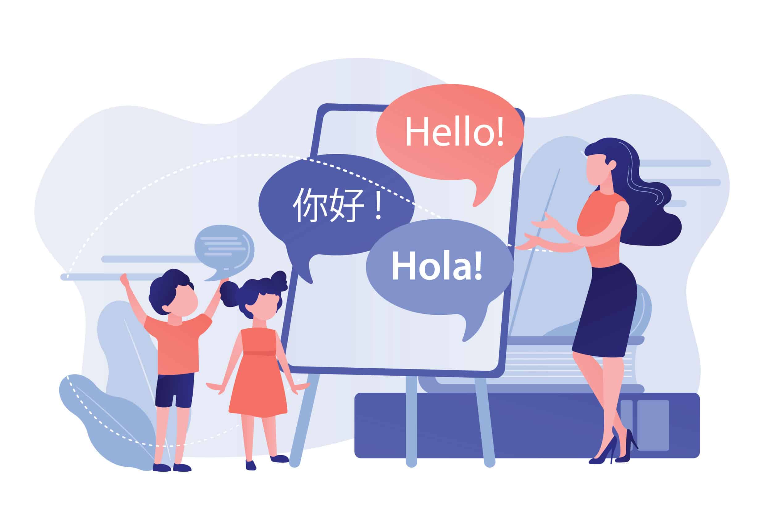
When an app forces a user to struggle against their own cultural or linguistic intuition, they don’t complain—they leave. App UI localization is no longer just about translating text; it is the structural and visual adaptation of your product to fit the mental model of a specific region.
Here is how deep UI localization impacts retention and how to adapt your design to stop the bleed.
The "Uncanny Valley" of UI Design
We often talk about the "uncanny valley" in robotics, but it exists in User Experience (UX) design too. When a French user opens an app that technically uses French words but retains an American layout, logic, or date format, it feels "off." This friction destroys trust.
If your UI doesn't breathe like a local app, users subconsciously categorize it as "foreign" and "temporary."
1. The Text Expansion Trap
One of the most common UI failures occurs when English is used as the base for design. English is notoriously compact. When you localize for markets like Germany, Russia, or Finland, the text volume can expand by 30% to 50%.
The UI Failure: Buttons break, text overlaps graphics, or ellipses (...) cut off critical instructions.
The Retention Cost: If a "Buy Now" button becomes "Buy..." due to lack of space, conversion drops to zero.
The Fix: Design your UI with dynamic spacing. Use responsive containers rather than fixed-width text boxes.
2. The Bi-Directional (BiDi) Challenge
For the Middle Eastern market (specifically Arabic and Hebrew speakers), translation is not enough. You are dealing with Right-to-Left (RTL) reading patterns.
It isn't just the text. The entire flow of time and logic must flip.
Progress bars: Must move right to left.
Back buttons: The arrow must point right, not left.
Carousels: Must swipe in the opposite direction.
Ignoring this is the UI equivalent of forcing a user to walk backward. They will inevitably trip and uninstall.
The Data: Localization is a Retention Strategy
Let’s look at the numbers. Localization is often viewed as a cost center, but the data proves it is a profit center.
According to industry benchmarks regarding app performance in non-English speaking markets, the correlation between deep localization (UI + Content) and User Lifetime Value (LTV) is undeniable.
Impact of UI Localization on Key Metrics:
| Metric | Non-Localized App | Fully Localized UI | Improvement |
| Download-to-Install | 12% | 18% | +50% |
| Day-30 Retention | 4% | 9% | +125% |
| Revenue Per User | $1.50 | $3.40 | +126% |
> Note: Data aggregates typical performance shifts in Tier-1 non-English markets (e.g., Japan, Germany, Brazil) when moving from machine translation to professional UI localization.
Visual Semiotics: Colors and Icons
Words account for only a fraction of communication. Your visual assets—icons, colors, and images—speak a language of their own.
The Color of Money
In the United States, green signifies profit and red signifies loss (or danger). If you are building a fintech or trading app for the Chinese stock market, you face a critical contradiction:
China: Red signifies rising prices (good luck/prosperity). Green signifies falling prices.
If your UI uses Western color coding in Shanghai, your users will panic when the market goes up and cheer when it crashes. That is a fatal UX error.
Iconography Hazards
Symbols are rarely universal.
The "Thumbs Up": A positive confirmation in the West, but can be offensive in parts of the Middle East and West Africa.
The Owl: Often used in Western education apps to signify wisdom. In parts of India, the owl can symbolize bad luck or foolishness.
Retention Tip: Audit your visual assets. If an icon requires a localized tooltip to explain what it means, the icon has failed.
How to execute UI Localization without breaking the code
To improve retention, you must integrate localization into the development cycle, not tack it on at the end.
Pseudo-Localization: Before translating a single word, run a "pseudo-localization" test. This replaces your English text with dummy characters that mimic the length of German or the height of Thai. If your UI breaks here, fix the code before you pay for translation.
Separate Text from Code: Hard-coded strings are the enemy of scaling. Use external resource files (strings.xml, .json) so linguists can work without touching your source code.
-
Context is King: Never send a spreadsheet of words to a translator. A button labeled "Book" could mean a novel (noun) or a reservation (verb). Without visual context, errors are guaranteed.
The Human Element in a Digital World
The difference between an app that gets deleted and one that becomes a daily habit lies in how well it understands the user. Algorithms can predict behavior, but they cannot replicate culture.
True localization requires a nuanced understanding of how people in different regions speak, play, and consume content. It requires a partner who understands the technical constraints of UI design and the fluidity of language.
This is where experience becomes your greatest asset. Artlangs Translation has spent years bridging these gaps. With expertise spanning 230+ languages, they go beyond simple text replacement. Whether it is complex game localization that respects UI boundaries, dubbing for short dramas and audiobooks that captures local emotional tone, or precise multi-language data annotation, their approach is holistic.
If you are looking to turn global downloads into loyal users, you need more than a dictionary. You need a localization strategy that respects the interface as much as the language.
Would you like me to analyze a specific screen of your app to identify potential localization pitfalls?